Top 5 YouTube Thumbnail Mistakes Even Pro Creators Make
Why Great Content Gets Ignored: The Packaging Problem
I spent the last month analyzing why great content fails.
Here's the brutal truth.
You can spend forty hours scripting, filming, and editing a masterpiece. You can have the best lighting setup in your studio and the crispest audio quality in your niche.
But if your packaging is weak, nobody cares. Period.
I've seen countless creators pour their souls into their work only to get ignored by the algorithm. It's heartbreaking to watch talented people create incredible content that never finds an audience. Usually, the culprit isn't the content itself.
It's that small 1280×720 pixel box acting as the front door to everything you've built.
Through my recent deep dive into high-performing channels across YouTube, Instagram, TikTok, and other platforms, I noticed a pattern. Even the pros slip up on the fundamentals. They get too clever for their own good. They prioritize aesthetics over effectiveness.
Let's fix that.
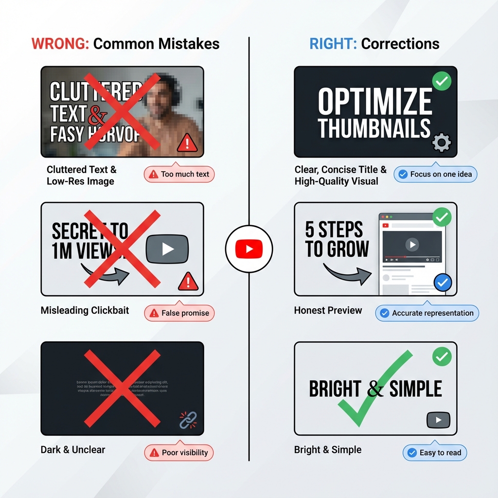
Visual Crime #1: The "Kitchen Sink" Syndrome
We've all seen it.
The creator tries to explain the entire premise of the content inside the thumbnail. They pack in four different images, a logo, multiple arrows pointing in every direction, and a full sentence of text overlay.
This is a disaster for your click-through rate.
Why Visual Clutter Destroys Engagement
The human brain scans content at lightning speed. Studies show that users make snap judgments about images in less than 0.3 seconds. When we see a cluttered image, we experience cognitive load—the mental strain of processing too much information simultaneously.
We get confused. We feel overwhelmed. We scroll past.
Your thumbnail is competing with hundreds of other pieces of content in the feed. Every additional element you add dilutes the power of your core message.
Real Examples of Kitchen Sink Thumbnails
Common offenders include:
- Multiple faces crammed into a single frame
- Text overlays that read like full sentences or questions
- Background images that compete with foreground subjects
- Logos, watermarks, and branding elements that take up significant space
- Decorative elements like arrows, circles, or starburst graphics that add no meaning
- Color schemes with 5+ different hues creating visual chaos
The Fix: Embrace Extreme Minimalism
Limit your text to three to five words maximum. If you can communicate your message with zero text and just a powerful visual, even better.
Pick one or two powerful visual elements. That's it. If everything is important, nothing is important.
Ask yourself: "What is the ONE thing I want viewers to take away from this thumbnail?" Then ruthlessly eliminate everything else.
Minimalist Thumbnail Framework
Follow this hierarchy:
- Primary element: One main subject (face, product, or key object)
- Secondary element: Optional text overlay OR supporting visual (not both)
- Background: Solid color, subtle gradient, or heavily blurred image
That's your entire thumbnail. Three layers maximum. The simpler your composition, the faster viewers process your message, and the higher your click-through rate climbs.
Visual Crime #2: The Invisible Ink Error
I see this constantly on design-heavy channels run by people with formal graphic design training.
The creator uses a beautiful, aesthetic font. Maybe it's a thin script typeface that looks elegant. Maybe they use pastel text on a light background because it looks "clean" and "sophisticated."
Spoiler: It looks invisible on actual devices.
Why Low Contrast Text Kills Your CTR
You must remember that most users are viewing content in Dark Mode across their apps. Muted colors often blend into the black or dark gray interface background. Thin fonts dissolve into illegibility when the image is shrunk down to mobile thumbnail size.
What looks perfectly readable on your large desktop monitor becomes completely unreadable on a smartphone screen, which is where the majority of your audience consumes content.
The Dark Mode Dilemma
Platforms like YouTube, Instagram, and TikTok now default to dark mode for most users. If your thumbnail uses:
- Light gray text on white backgrounds
- Pastel colors without strong contrast
- Thin or delicate font weights
- Low opacity overlays
Your carefully crafted text literally disappears against the dark interface. The viewer sees a muddy, unclear image with no clear message.
The Fix: Prioritize Contrast Above All Else
High Contrast Text Techniques:
- Stroke method: Add a 4-6 pixel black or white stroke around all text
- Shadow method: Apply a drop shadow with 80%+ opacity directly behind text
- Background bar method: Place text on a semi-transparent colored bar
- Dual tone method: Use colors from opposite sides of the color wheel (blue/orange, red/green)
Test your thumbnail in both light mode and dark mode before publishing. If the text isn't immediately readable in both scenarios, you need more contrast.
Contrast Ratio Standards
Professional designers aim for contrast ratios of at least 4.5:1 for normal text. For thumbnails, you should target even higher ratios of 7:1 or greater. Use online contrast checkers to verify your color combinations meet accessibility standards.
Visual Crime #3: The Desktop Trap
This is the most common technical mistake I see among creators who use professional editing software.
You design your graphics on a massive 27-inch 4K monitor. Everything looks crystal clear. You can see every subtle detail in the background. The composition looks balanced and professional.
But here's the reality check that most creators ignore.
Mobile Viewing Statistics That Change Everything
Over 70% of your audience is holding a phone. They're looking at a screen the size of a playing card, often while sitting on a bus, waiting in line, or lying in bed.
The thumbnail that looks stunning on your desktop becomes an incomprehensible mess on mobile. Fine details vanish. Facial expressions become unclear. Text becomes unreadable.
Understanding Platform Kill Zones
Different platforms overlay different information on thumbnails:
- YouTube: Duration stamp in bottom right corner (approximately 60×30 pixel area)
- Instagram: Profile picture overlays the bottom left on feed posts
- TikTok: Various UI elements can cover edges during browsing
- Facebook: Video length and profile information overlay thumbnails
The Fix: Design for Mobile First
Mobile Preview Workflow:
- Export your design at full resolution
- Open it on your actual smartphone
- View it in the platform's native app
- Check if text is readable within 2 seconds
- Verify the main subject is immediately identifiable
- Ensure no critical elements fall in kill zones
Always zoom out to 10% size while designing. View your thumbnail at actual mobile dimensions (approximately 168×94 pixels for YouTube mobile). If you cannot identify the subject instantly, the design has failed.
Responsive Design Principles for Thumbnails
- Minimum font size: 72pt for desktop design (scales to readable size on mobile)
- Maximum text length: 5 words to prevent mobile overflow
- Face size: Faces should occupy at least 40% of frame to be recognizable on small screens
- Safe zone: Keep all critical elements within the center 80% of the frame
Visual Crime #4: The Emotionless Void
We are biologically wired to look at other humans.
It's an evolutionary survival trait hardwired into our brains over millions of years. We automatically scan for eyes and expressions to gauge safety, trustworthiness, or interest. Thumbnails that lack a clear focal point or an expressive face often feel sterile, forgettable, and unclickable.
The Neuroscience of Facial Recognition
The fusiform face area in our brains activates within 170 milliseconds of seeing a human face. This automatic response happens before conscious thought. We can't help but look at faces and interpret their emotional states.
Thumbnails featuring faces consistently outperform abstract graphics, landscapes, or product shots by significant margins. Data from multiple platform studies shows that thumbnails with faces generate 30% to 50% higher click-through rates than thumbnails without human elements.
Why Emotion Beats Information
Viewers don't click on information. They click on feelings.
A neutral expression conveys no emotional payoff. A smile suggests positive content. A shocked expression promises surprising information. An angry or intense face signals controversial or important content.
The Fix: Show Extreme Emotion with Clear Focal Points
You need a singular focal point to anchor the eye.
Ideally, this is a human face showing an extreme emotion. Not a slight smile—a huge grin. Not mild surprise—complete shock with wide eyes and open mouth. Not subtle concern—obvious fear or worry.
Amplify every expression to cartoon levels. What feels over-the-top to you reads as appropriately engaging to scrolling viewers.
Emotional Expression Guide for High CTR
Use these emotions strategically:
- Shock/Surprise: Wide eyes, open mouth, raised eyebrows (Best for: Unbelievable facts, shocking revelations)
- Joy/Excitement: Big genuine smile, bright eyes, energetic posture (Best for: Success stories, positive tutorials)
- Anger/Intensity: Furrowed brow, intense gaze, set jaw (Best for: Controversial topics, rants, call-out content)
- Fear/Concern: Worried expression, protective body language (Best for: Warnings, cautionary tales)
- Confusion/Curiosity: Tilted head, questioning expression (Best for: Mysteries, explainers, "why" content)
Visual Crime #5: The Identity Crisis
Imagine if Coca-Cola changed their logo color from red to blue, then to green, then to purple every week.
You'd stop recognizing them on the shelf. The brand would become invisible through inconsistency.
Yet creators do this all the time with their thumbnails. One week they use grunge fonts and dark moody colors. The next week it's neon minimalist with geometric shapes. The week after that it's hand-drawn cartoon style.
The audience never learns to recognize their work in the feed. Every piece of content looks like it came from a different creator.
Why Brand Inconsistency Destroys Channel Growth
Inconsistency destroys trust and recognition. Your thumbnail is not just a gateway to individual pieces of content. It's a cumulative branding opportunity.
When viewers see your content repeatedly and can instantly recognize it as yours, several psychological effects compound:
- Familiarity bias: We prefer things we've seen before
- Trust building: Consistent branding signals professionalism and reliability
- Pattern recognition: Our brains reward recognizing patterns with dopamine
- Brand loyalty: Repeated positive experiences create emotional attachment
The Fix: Develop a Consistent Visual Identity System
Pick a lane. Choose a specific color palette (2-3 primary colors maximum), a standard font family (one for headers, one for body if needed), and a recurring layout style. Stick to it religiously across all content.
You want your audience to spot your content while scrolling at high speed and think, "Oh, that's one of theirs. I love their stuff."
Building Your Visual Brand System
Create a brand guidelines document that defines:
Color Palette
- Primary brand color (your signature color)
- Secondary color (for contrast and variety)
- Accent color (for highlighting and calls to action)
- Background colors (light and dark options)
Typography System
- Header font (bold, attention-grabbing)
- Subheader font (if needed, should complement header)
- Maximum font variations per thumbnail (usually 2)
Layout Templates
- Face placement rules (left third, right third, center)
- Text placement zones (top, bottom, side)
- Logo/watermark position (consistent corner)
Examples of Strong Visual Brand Systems
Study these creators who have nailed consistent branding:
- MrBeast: Bright colors, shocked expressions, bold yellow text
- MKBHD: Clean minimalist style, red accent color, centered product shots
- Vsauce: White text on dark backgrounds, Michael's face in specific poses
- Ali Abdaal: Warm color grading, friendly expressions, yellow accents
You can identify their content from the thumbnail alone, often without reading the title. That's the power of visual consistency.
Use our free YouTube Thumbnail Downloader to save examples from top creators in your niche. Build a reference library of high-performing thumbnails to identify consistent visual patterns and brand elements that you can adapt for your own channel.
The Click-Through Rate Audit: Diagnosing Your Thumbnail Problems
Now that you understand the five visual crimes, audit your existing content to identify which mistakes you're making most frequently.
How to Perform a Thumbnail Audit
- Export your last 20 thumbnails into a single folder
- View them at mobile size (zoom to 10% or use a phone)
- Time yourself: Can you identify the subject of each in under 2 seconds?
- Check for patterns: Do you consistently make any of the five mistakes?
- Compare to competitors: How does your visual branding compare to successful channels in your niche?
Download competitor thumbnails using our thumbnail extraction tool to conduct side-by-side comparisons. Analyze what makes their thumbnails work and identify specific design elements you can test in your own content.
Analytics-Driven Improvement
Use platform analytics to identify your best and worst performing thumbnails by click-through rate. Look for patterns:
- Do thumbnails with faces perform better?
- What color schemes generate the highest CTR?
- Does more text correlate with lower performance?
- Which emotions drive the most clicks?
Let data guide your design decisions, not personal aesthetic preferences.
Advanced Thumbnail Psychology: Beyond the Five Crimes
Once you've eliminated these five visual crimes, implement these advanced strategies:
The Contrast Principle
Place opposites next to each other to amplify impact:
- Before-and-after images side by side
- Large versus small objects
- Bright versus dark areas
- Smooth versus textured surfaces
The Implied Motion Technique
Create the sense of movement in static images:
- Action poses caught mid-movement
- Objects appearing to fly or fall
- Directional lines leading toward subjects
- Motion blur on background elements
The Mystery Gap Method
Show partial information that demands completion:
- Partially visible objects
- Cropped faces showing only eyes
- Blurred or obscured key elements
- Questions posed visually without answers
The Social Proof Signal
Incorporate elements that suggest popularity:
- Multiple faces suggesting group consensus
- Crowd reactions
- Achievement symbols (trophies, medals, checkmarks)
- Before-and-after transformations
The Bottom Line: Design for Humans, Not Algorithms
The five visual crimes share a common root cause: forgetting that real humans view your thumbnails on real devices in real-world conditions.
Stop designing for the algorithm. Stop optimizing for your own monitor. Stop creating thumbnails that only look good in isolation on design software.
Design for the tired person scrolling on their phone during their commute. Design for the distracted viewer watching on their TV from across the room. Design for the person who gives you 0.3 seconds to capture their attention before moving on forever.
Eliminate clutter. Maximize contrast. Test on mobile. Show emotion. Build consistency.
Your click-through rate will reflect your discipline in avoiding these five visual crimes. Fix them today and watch your growth accelerate tomorrow.
Study High-Performing Thumbnails
Download HD thumbnails from successful creators to build your reference library
Download Thumbnails Free →